Prep & Plate
Contract frontend role: transformed a desktop-only meal planning SaaS into a fully responsive mobile experience.
Introduction
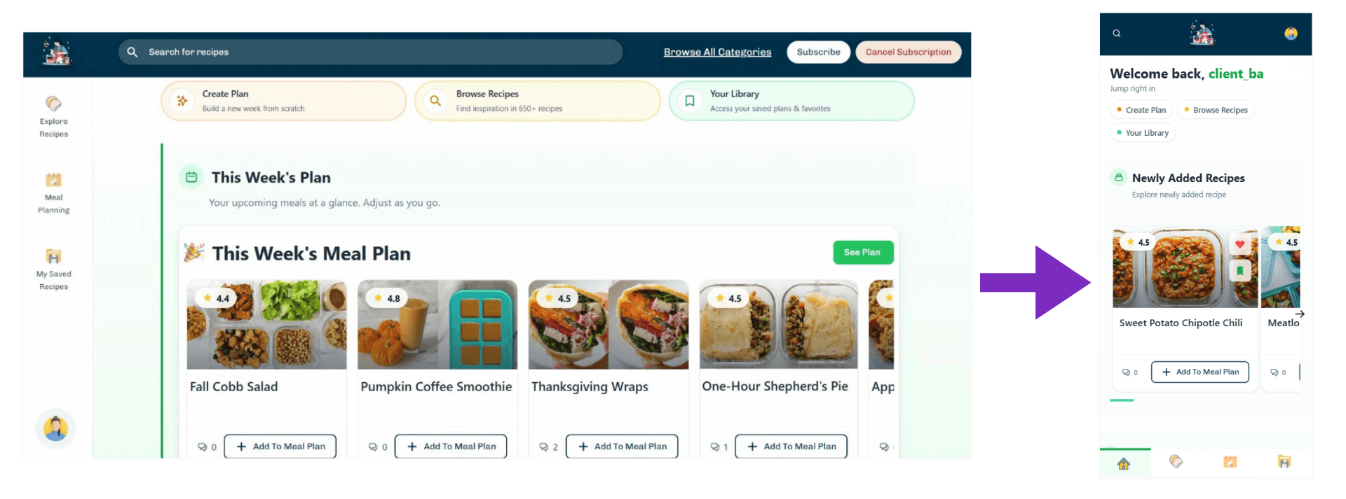
Prep & Plate is a SaaS meal planning platform. I joined as a contract frontend developer alongside an existing backend team. My engagement had a single clear focus: the application was built desktop-first and mobile users had a broken experience. I was brought in to fix that, transforming every screen into a responsive, app-like layout without touching the backend.
Prep & Plate
Project overview
The platform had been built for large screens, which left mobile users with cramped layouts, poor navigation, and unusable interactions on smaller devices. Working within the existing React and Redux Toolkit codebase, I took full ownership of the mobile experience, adapting every screen to work naturally across devices while preserving the existing functionality and backend integration.
Technical challenges
The problems that required the most thought while building this project.
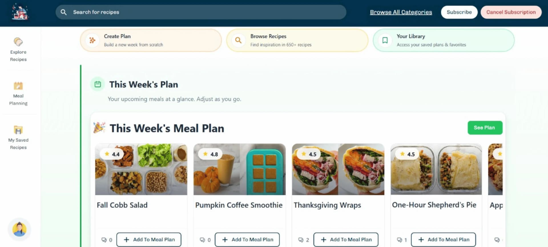
The interface was optimized for large screens, making it difficult to use on mobile devices due to cramped layouts, poor spacing, and lack of touch-friendly interactions.
All core features needed to remain accessible on smaller screens without overwhelming the user, requiring careful restructuring of components and layout flow.
Architecture
The project was built using React with Redux Toolkit for state management. My work focused on enhancing UI responsiveness without altering the underlying application architecture.
    Worked within the existing component
    structure and improved layout responsiveness
    using Tailwind CSS and flexible design patterns.
Development process
How I approached building this from first commit to deployment.
Interface evaluation
Analyzed the desktop layout to identify areas that would break or become unusable on smaller screens.
Responsive restructuring
Rebuilt layouts using flexible grids and stacking patterns to ensure smooth behavior across devices.
Mobile experience refinement
Improved spacing, touch targets, and navigation flow to create a more intuitive, app-like experience.
Key features built
The main modules I built end-to-end.
Responsive layout transformation
Converted desktop screens into fully responsive layouts that adapt smoothly across all screen sizes.
Mobile-first usability improvements
Enhanced navigation, spacing, and touch interactions to create a smoother, app-like experience on mobile devices.
Outcomes
What the project delivered.
Improved UX
Better usability and navigation on mobile devices
Fully responsive
Consistent experience across screen sizes
Enhanced clarity
Cleaner layout and improved content readability